The Growing Influence of Digital Signage
Digital signage is a growing medium businesses are employing to communicate with their audience in new and exciting ways. As the industry continues to expand, digital signage companies will continue to implement new features that will help keep viewers captivated. However, a solid knowledge base will help you get the most out of your digital signage software. If you find yourself asking “What is a digital sign?” or “How does digital signage work?” then you are in the right place!
Challenges to Consider
Implementing digital signage into your communication strategy comes with unique challenges that are important to consider. The most obvious hurdle is the cost. Buying a digital screen, partnering with a software provider, and getting hardware together are all expensive investments. Nevertheless, the return on investment is also much higher than traditional media. Digital signage software gets more attention and better recall rates than print media. With proper planning and a strong strategy, your signs can actually increase income over time.
Another factor to consider is that using digital signage requires a certain degree of technical expertise. Although most digital signage software is made to be as user-friendly as possible, working with technology will always be harder than pen and paper. Proper training and guidance need to be implemented to ensure your team is equipped to succeed. That is why REACH offers 24/7 support, in-depth training guides, and routine training.
Digital Signage in Action: 10 Successful Projects
Successful digital signage campaigns are all around us and serve as great sources of inspiration for future ideas. Below, we have analyzed 10 digital signage products that stood out amongst our clients. Each layout has been designed using REACH’s powerful digital signage tools. More examples can be found by checking out our templates page. Here, you can view a variety of digital signage examples across multiple industries.
Example 1 – Lamar University
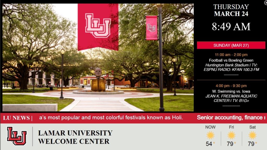
Lamar University employs excellent digital signage strategies that are suited for the education industry. Since we are in a welcome center, it is appropriate that the playlist contains content that previews scenic campus locations. Considering this is likely the first building visitors will walk into, having the playlist be the most prominent asset will grab immediate attention. Events scroll alongside the playlist, making it easy for people to see what there is to do in the area. News and weather applications are provided as useful tools that can help visitors plan their day.
Example 2 – Martin P. Slark Fitness & Wellness Center
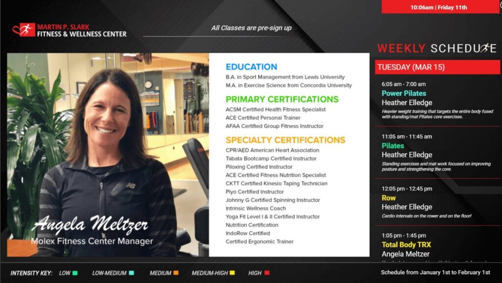
This is an excellent example of making your most crucial information easy to find. As a fitness center, Martin P. Slark ensures that their weekly schedule takes up a lot of space in their layout, and stretches from the top to bottom of the display. This calendar is very detailed, displaying times, classes, and who will be leading each session. The playlist provides some background information on each trainer, allowing viewers to get a sense of their personality beforehand. Lastly, an intensity key is included at the bottom that allows viewers to determine which workouts are right for them.
Example 3 – Stonhard Group
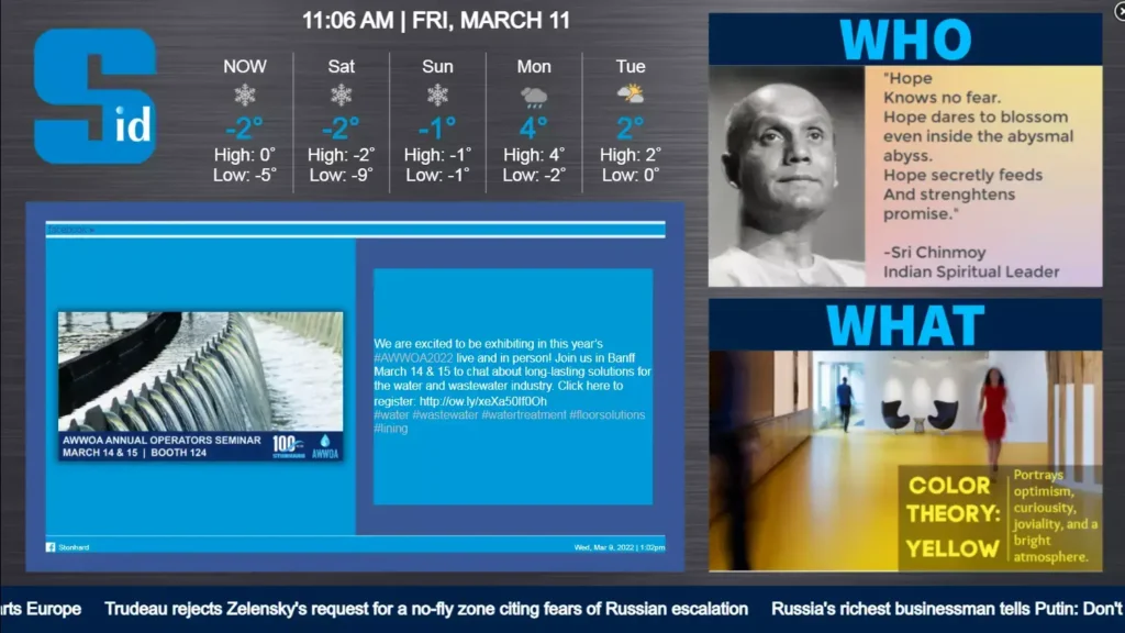
Stonhard Group lets social media do a lot of the talking in their layout. The social media section is prominent, easy to read, and includes both images and text to give viewers a complete experience. The social media zone is also designed to fit their branding, making the entire layout more coherent. Including inspiring quotes and company values can motivate and inspire employees, boosting overall productivity. The ticker and weather apps fill out the gaps in the layout while still providing useful information.
Example 4 – Carter Machinery
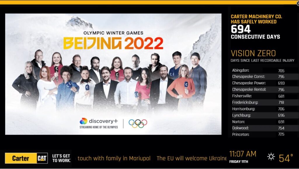
Carter Machinery makes excellent use of REACH’s counter and data list applications. Working in a manufacturing plant can be dangerous with all the machinery around. Keeping a counter of how many days have gone by without an incident inspires employees to keep the streak going and adhere to proper safety protocols. Using a data list to compare each facility to one another also introduces some friendly competition and further motivation. Finally, the playlist offers some entertainment provides a break from the strenuous workday.
Example 5 – Carbon Valley Parks & Recreation District
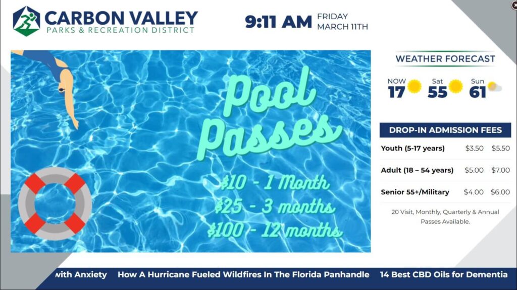
Carbon Valley Parks & Recreation does a great job of having each design element work together. The color scheme provides great contrast that immediately catches the eye. From there, the playlist includes advertisements for pool passes, summer camps, and other activities. A quick glance to the right reveals additional admission fees people can sign up for. Including weather information makes sense as it could affect certain events. Meanwhile, the ticker provides real-time news updates.
Example 6 – Fresenius Kidney Care
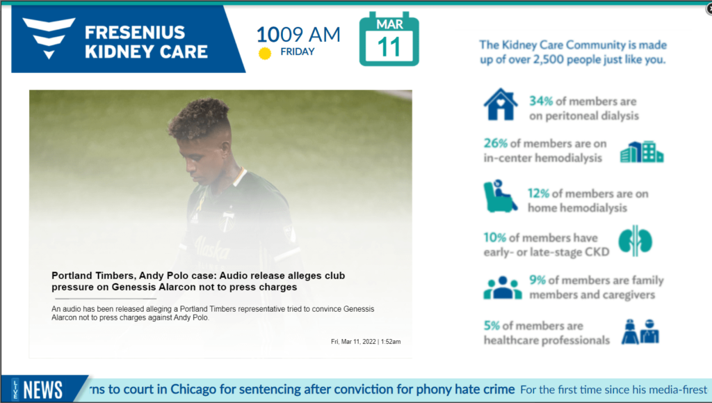
Health and wellness centers often leave visitors waiting around for their appointments. Fresenius Kidney Care takes this idea into careful consideration for its layout design. Including a prominent playlist that delivers news articles centered around sports, entertainment, and other industries can help cut down perceived wait times. However, useful health tips can still be found right next to the playlist. Fresenius employs a complete experience that will results in a greater overall level of satisfaction
Example 7 – Media Real Estate
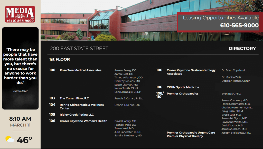
This is a prime example of digital wayfinding done right. Media Real Estate immediately lets visitors know what building they are in and what floor. From there, the bulk of the content focuses on clearly telling viewers where each office is. Additional information such as who is working in each office can help audiences feel more secure navigating your facilities. Including inspiring quotes off to the side adds some personality to the design as well.
Example 8 – Huber Heights YMCA
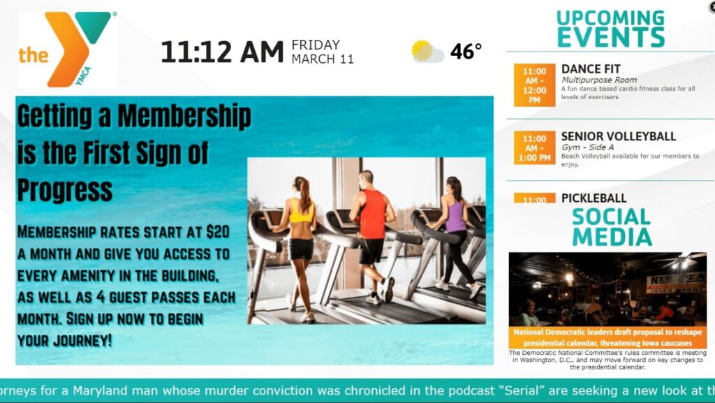
Huber Heights YMCA‘s layout offers a variety of content that all flows together nicely. The color scheme is consistent throughout and each zone is well-spaced. This allows viewers to absorb each facet of the design without being overwhelmed by content. In addition, the variety incentivizes people to return for fresh content, allowing Huber Heights to build a connection with the audience.
Example 9 – Ascend Federal Credit Union
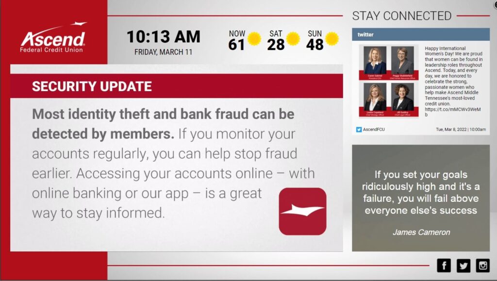
Ascend Federal Credit Union exemplifies how digital signage can directly assist your audience. Each playlist item is displayed prominently onscreen and details useful security tips and banking lessons. This serves the dual purpose of both entertaining and informing viewers. Over time, this adds value to your screens that will attract more attention. In turn, viewers will be encouraged to return to your displays to learn new advice.
Example 10 – Rocky’s BBQ
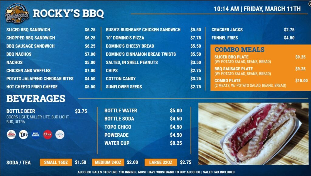
Finally, our last example is a digital menu board. Rocky’s BBQ has all the key design elements you would look for in a menu board. The high contrast makes each menu item pop from the screen. This makes it much easier to read. In addition, combo meals and drink sizes are highlighted in a distinct color, differentiating them from the rest of the menu items
