Digital signage apps
Top K-12 apps
There are 56.4 million K-12 students in the United States, according to the National Center for Education Statistics. With such a large student body, it is more important than ever to ensure sufficient communication models are in place to guarantee the success of each child. With the right tools, digital signage can be an efficient way to broadcast large amounts of information productively.
REACH’s content management software contains an array of apps that provide great flexibility in your communication efforts. However, to enrich the learning experience of your students, it is important to recognize what apps can prove most valuable and how to use them effectively. In this document, we will go over the top apps for k-12 education and how they benefit both software users and school staff/students.

TOP digital K-12 apps
Why Digital Signage?
Before implementing digital signage into your schools, it is important to understand the benefits it will bring to the learning experience to develop a successful communication strategy. Whether creating content behind the screen or directly consuming it, REACH’s cloud-based management software grants a variety of perks for users and viewers alike.
TOP digital K-12 apps
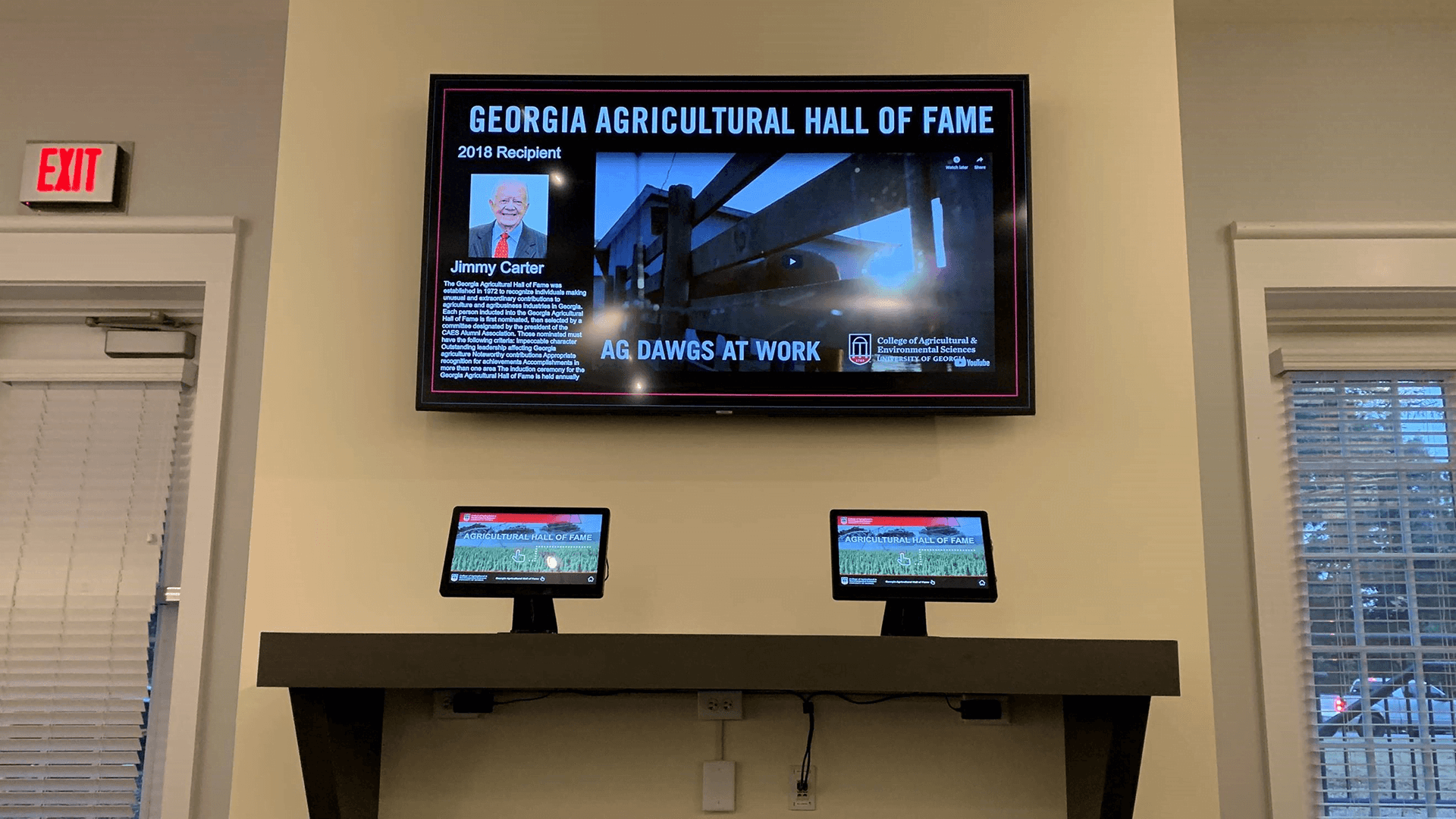
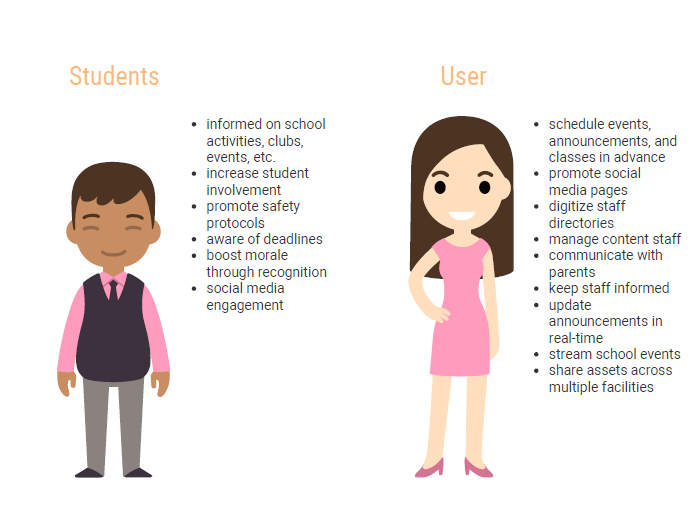
Media Library & Playlist
The Media Library and Playlist applications are the most used apps for all digital signage needs, and the two go hand-in-hand in terms of functionality. The Media Library is not only where you store assets, but also where you can create original content using the in-house announcement editor or through Canva integration. The Playlist app then allows you to arrange your assets to play in any order of your choosing.
The result is a constant flow of information that keeps your content rotation fresh and exciting. With these two applications, you can convey a large amount of material succinctly and efficiently.
TOP digital K-12 apps
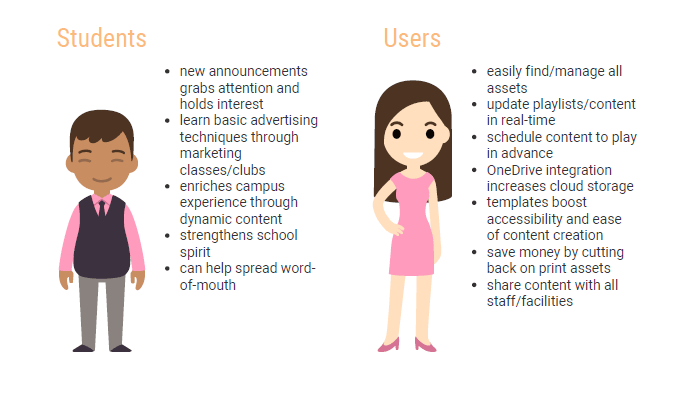
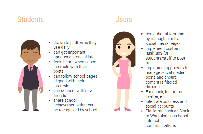
Social Media Apps
Social media has become a mainstay for students to share their lives and interact with peers. Similarly, schools can use social media to reach their student body through platforms they are familiar with. This will increase the relatability of the school, drawing in more students and strengthening their attachment. With proper integration, social media can be used to spread information and interact with students. More and more parents are also joining social media, making these platforms an excellent tool for keeping them in the loop.
TOP digital K-12 apps
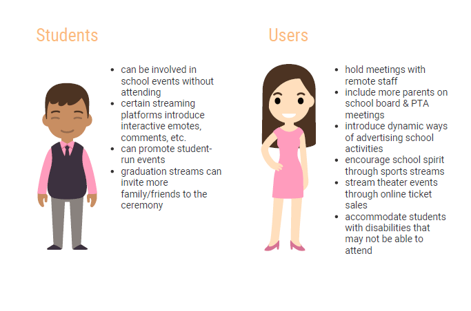
Video Streaming
Streaming is a growing method of consuming content as the online space continues to expand. Movies, music, and video games can all be streamed, and that list continues to grow. With digital signage, video streaming offers a way to reach a wider audience and accommodate those who cannot attend certain events.
Video streaming grants a great deal of flexibility in terms of what can be displayed. From guest speakers to theater productions, video streaming provides a way to make sure school events reach their highest potential.
TOP digital college apps
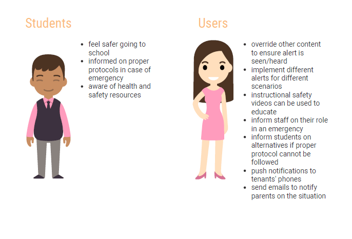
Emergency Alerts
Even more so than educating, schools have the responsibility of guaranteeing the safety of both their students and staff. Strategically placed digital signage can help ensure safety for everyone by grabbing their attention and instructing them on proper protocol.
Emergency alerts can be tailored for any scenario to avoid confusion when put into effect. The result is a safer campus that takes active steps to prevent danger.
TOP digital K-12 apps
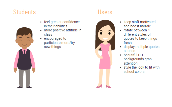
Quotes App
Everyone needs a little boost now and then. Finals week, AP testing, and SAT preparation are stressful for students and staff alike. Introducing encouragement through digital signage can carry an atmosphere of positivity that gets everyone through the week. REACH’s Quotes app curates a range of quotes that can inspire everyone to push through the challenges of the school day.
Related Articles
- Top Digital Signage Apps for K-12
- Top Digital Signage Apps for Colleges
- How to Use Digital Signage for Your School
- Digital Signage for K12 Schools
- REACH Partners with North Western University for College Digital Signage
- School Digital Signage Solutions for Educational Institutions
- REACH Partners with Emergency Notifications Provider for School Digital Signage
- Digital Software and Hardware Solutions for Education
- Interactive Displays for Colleges and Universities
- REACH Partners with California Schools for School and College Digital Signage Solutions
Request a demo
Get started
REACH is dedicated to helping our clients maximize their potential. By partnering with REACH, you join a team of industry experts and design professionals that are ready to provide you unlimited service.